A child’s first impression of a space matters. Walk into a room that feels cold or clinical, and nerves rise. Step into a room filled with soft blues, leafy greens, and warm light, and the experience shifts the environment says, “you’re safe here.” At IDS Kids, color isn’t just decoration; it’s an emotional anchor that helps children feel calm and supported through every visit.
At IDS Kids, we create more than murals; we design emotional anchors. In this blog, explore the seven most calming colors for children’s spaces and how our themed environments turn every visit into a warm, unforgettable experience.
Why Calming Paint Colors Make All the Difference for Kids
In pediatric environments, every color tells a story. Soft blues build trust and calm. Gentle greens restore balance. Warm yellows inspire creativity and engagement. These aren’t just painted walls, they’re emotional landscapes shaping how children feel in a space. The right palette can help a child decide whether they feel tense or safe, anxious or at ease.
Research shows the right hue can reduce anxiety, improve concentration, and make visits more memorable. That’s the calming effect of thoughtful color and why calming paint colors and murals, paired with natural light and smart accent walls and furniture, matter so much.
We merge psychology and storytelling to craft immersive environments. From choosing the perfect shade to installing ceiling murals designed to help ease tension, we understand how to design spaces that truly support children. Next, we’ll explore seven of the best colors for soothing pediatric spaces.
The 7 Best Calming Colors for Pediatric Spaces
Designing pediatric spaces that soothe, calm, and engage young visitors is no small task. The paint colors and murals you choose for these environments play a pivotal role in how children feel, especially in medical or educational settings where anxiety can easily take over.
It’s more than just aesthetic; colors have the power to create emotional connections, foster a sense of safety, and even enhance a child’s ability to focus or relax.
Here are the seven best calming colors that have been carefully selected not just for their beauty, but for their ability to work wonders on a child’s mind and mood. These hues, used thoughtfully in design elements like paint colors, murals, furniture, and clever use of lighting, can make all the difference in how a child experiences a space.
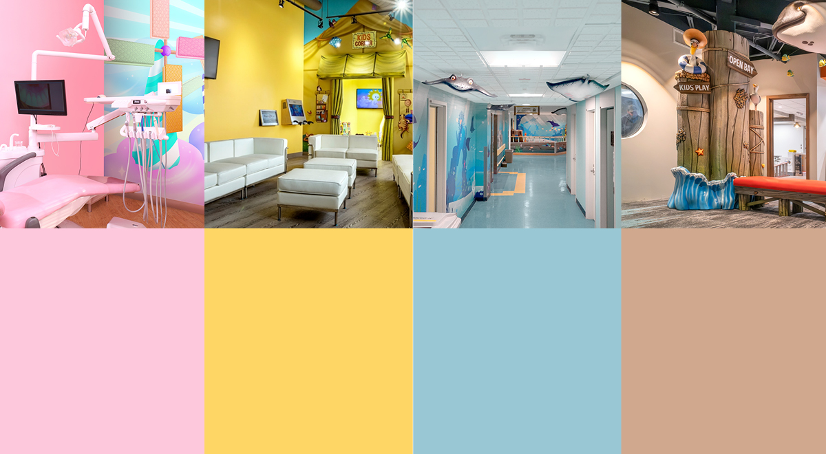
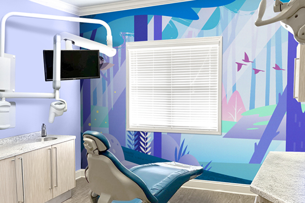
1. Soft Blue Color Palettes
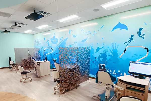
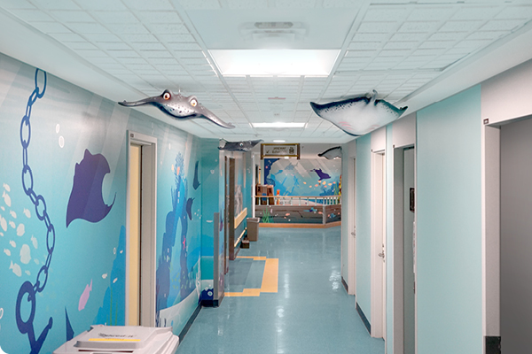
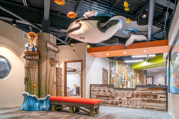
Soft blues are one of the best calming colors for pediatric spaces. They are associated with lower anxiety and can build trust, making them perfect for treatment rooms and waiting areas. Picture a serene ocean mural or a sky-blue ceiling that instantly puts kids at ease.
Take a look at our Deep Sea Adventure Waiting Room, where ocean murals and blue accents transform a regular medical office into a calming, welcoming space for young patients. It’s the perfect color to set a soothing mood!
2. Leafy Greens & Mint Color Palettes
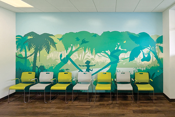
Leafy greens and mints are nature’s soothing tones. They help restore balance and improve focus, making them perfect for classrooms, libraries, and exam rooms. These colors bring the outdoors inside, helping children feel calm and grounded.
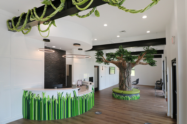
In our Jungle Hut Pediatric Dental and Ortho Office, lush green murals and forest scenes create a tranquil environment that supports concentration and relaxation. These calming colors help boost productivity and focus, ensuring children feel at ease in every corner.
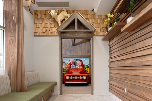
3. Pastel Pinks & Lilac Color Palettes
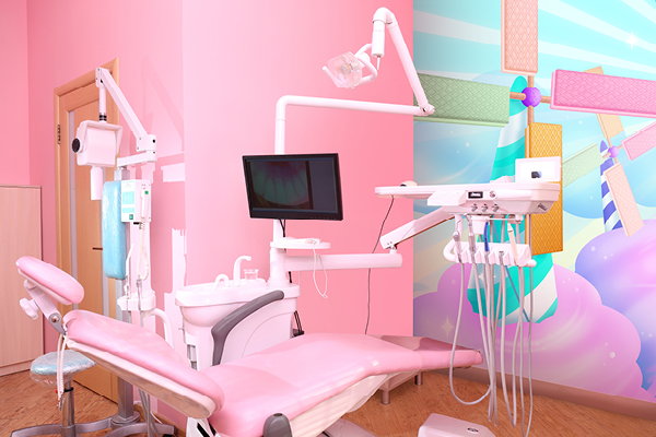
Pastel pinks and lilacs are the ultimate colors for creating warmth and comfort. They can help reduce feelings of fear and anxiety, making them ideal for pediatric wings and literacy corners. These soft hues evoke safety, helping children feel secure in spaces where they might be nervous.
Our designs can incorporate pastel pinks and lilacs to create an enchanting space filled with whimsy and comfort, just like what you’d see in a fairy tale pediatric wing. The combination of calming colors and fairytale murals allows children to relax, escape into a fantasy world, and feel safe during their visits.
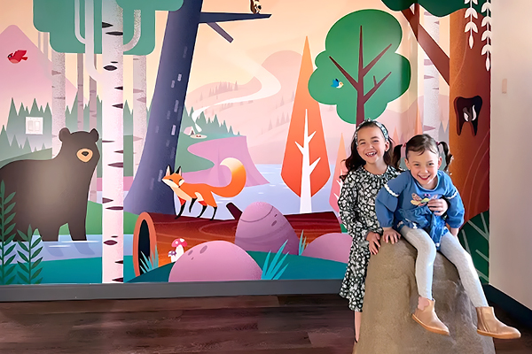
4. Earthy Beige & Warm Taupe Color Palettes
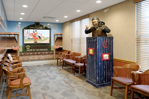
Earthy beiges and warm taupes provide the perfect neutral backdrop, reducing overstimulation and offering a grounded, calming atmosphere. These tones work well in hallways, seating areas, or floor-to-wall transitions.
In our Cozy Woodland Office and Reception, earthy beiges and taupes set the stage for nature-inspired murals that invite calm while still maintaining a warm, welcoming vibe. These colors complement vibrant elements without overpowering the space, making it inviting and relaxing for both children and parents.
5. Whites with Warm Undertone Color Palettes
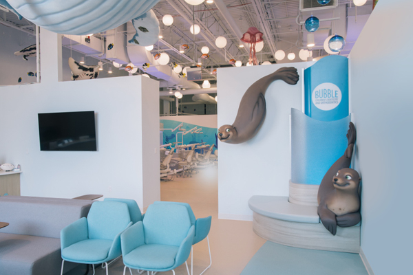
Whites with warm undertones bring light and warmth to a room, brightening the space without feeling cold or clinical. Perfect for ceilings, signage, and backdrops, these colors create an open, airy atmosphere that doesn’t feel sterile.
In our beautiful Ocean Recovery Room, bright sky whites combined with ocean murals transform a clinical space into a serene, uplifting environment. The natural light enhances the warmth of these tones, making the room feel welcoming and relaxing, perfect for recovery.
6. Buttery Yellow Color Palettes
Buttery yellows are full of joy, creativity, and energy. They’re ideal for play areas, activity corners, and wayfinding, where you want to encourage exploration and fun. Yellow sparks happiness and curiosity, helping children feel engaged and inspired.
We can incorporate vibrant yellow accents and murals to create a lively, cheerful space where kids can explore, play, and learn. This uplifting color boosts creativity and makes any space more inviting, ensuring children feel excited and curious in every corner.
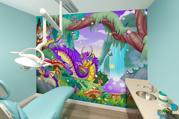
7. Soft Purples & Periwinkle Color Palettes
Soft purples and periwinkles spark creativity and curiosity, making them perfect for reading corners, sensory play areas, and creative studios. These hues encourage children to explore their imaginations and foster a love for learning.
We can incorporate soft purples and periwinkles to set the stage for a magical environment, bringing whimsy and inspiration to young readers, just like in an Enchanted Forest Reading Nook. These colors, combined with enchanting forest murals, create a captivating space that fuels curiosity and inspires a love for reading.

Colors That Can Do More Harm Than Good
While certain colors can create a calming and inviting environment for children, some hues can be overwhelming or induce anxiety. It’s important to use colors thoughtfully, as their emotional impact can vary significantly.
- Harsh Reds: Although energizing, red can increase anxiety and agitation, making it unsuitable for treatment rooms. Use it only as an accent, not as the primary color.
- Neon Greens: Neon greens can be too stimulating and may create a sense of discomfort. It’s best to reserve these shades for small details or accents, not entire walls.
- Clinical Whites: While white reflects light, it can feel cold and sterile in pediatric spaces, making children feel more anxious. Choose softer whites or warm tones to create a welcoming atmosphere.
In short, Colors like bright red, neon green, or stark white can feel playful at first glance, but to children they often send the wrong message. Red can heighten anxiety, neon tones can overstimulate, and clinical whites can feel cold instead of comforting. That’s why we recommend using these shades only in small accents, balanced by calmer tones that make kids feel secure.
Choosing the Right Colors for Different Spaces
Color isn’t just a visual treat; it’s the secret ingredient that shapes the energy and functionality of a space. At IDS, we don’t just choose any color; we recommend the perfect one for your space, transforming it into something truly magical.
| Space Type, | Recommended Colors | Purpose & Psychological Impact |
| Dental & Medical Offices | Soft blues, greens | Create a sense of tranquillity. Adding ceiling murals and thoughtful lighting cues can support calmer focus, helping to keep both staff and patients comfortable.nd staff. |
| Hospitals & Pediatric Clinics | Light tones, natural murals | Guide visitors through the space, reducing anxiety and reinforcing healing. These perfect colors also help with wayfinding, making the experience smoother. |
| Libraries & Schools | Soft pastels, bold orange accents | Enhances focus; orange sparks creativity; turns learning into an exciting adventure. The perfect color choices inspire young minds to engage and explore. |
| Malls & Play Centres | Bright murals, accent walls | Inject energy into the space, creating an exciting environment. The right colors spark joy, providing both fun and function. |
Lighting, Ceilings, and Sensory-Smart Design: Not Just Color, But How It’s Seen
The visual experience in a pediatric space goes beyond just the color on the walls. In spaces where natural light is limited, we coordinate with your lighting designer/EC to keep the atmosphere warm and visually balanced. Ceiling murals, often the only view a child has during treatment, become more than art. They’re comfort, they’re a distraction, and they’re a story to hold onto.
For children with sensory sensitivities, muted tones and balanced light create a relaxing environment. At IDS Kids, we expertly integrate murals and theming and coordinate with your lighting and furniture plans for a cohesive design, ensuring every detail contributes to an immersive, calming space.
What a Child Remembers Shapes What They Expect
Kids don’t remember paint chips; they remember how a room felt. A first visit wrapped in story-led color and gentle lighting becomes the baseline they expect every time.
- Start with subtle gray walls for a calm field; layer calm colors for office accents through murals and wayfinding.
- Choose the best paint color per zone (exam vs. play), and reserve dark colors for small, grounding trims.
- Keep one “great color” per area and just two other colors (simple, memorable ideas win).
- Make it tactile: ceiling scenes, discovery nooks, soft textures.
- Coordinate your furniture plan (desks, seating, storage with IDS palettes and custom themed millwork to echo the scheme
When color, storytelling, and furnishings sing together, fear fades, and families return calmer, more compliant. Kids remember comfort, not procedures. Design for that memory, and every visit gets easier.
From Psychology to Production, IDS Brings It All Together
Trusted by clinics, schools, and attractions, IDS pairs child psychology with built science. With 18+ years and 800+ themed projects, our premium fabrication turns stories into spaces. Spaces that are precisely fitted and code-aware; final approvals by your architect/authority having jurisdiction.
From discovery to installation, IDS handles everything: research-led design, precision build, and installation. We coordinate with facilities, optimize themed zones and wayfinding within your approved plan in collaboration with your architect/GC, integrate interactive elements, and keep budgets, schedules, and safety clear.
Every mural, wall, and prop is engineered for high-touch spaces (cleanable and chip-resistant). Need speed? IDS Essentials™ delivers ready-to-install themes with cohesive paint colors and accents and guidance from order to installation.
Ask IDS: Color, Light, and Little Minds
1) How does natural light influence calming paint colors in pediatric spaces?
Natural light shifts how hues read throughout the day, so test large swatches under morning and afternoon sun. Pair low-saturation blues/greens with task lighting (3500–4000K) to keep tones consistent.
Coordinate the palette with office furniture finishes and wall art so everything feels calm, cohesive, and cool rather than clinical.
2) What are the best colors for exam rooms versus play areas?
For exam rooms, choose softer hues like pale blue, mint, or warm off-white to create a calm, focused atmosphere for both kids and caregivers.
In play areas, you can introduce more color and personality to complement the theming and play structures. Use bright, cheerful tones in accents or feature walls, while keeping surrounding areas balanced with lighter, neutral shades. This approach keeps the space playful and energetic without becoming visually overwhelming, allowing your themed elements to take center stage.
3) How do I pick calming paint colors when natural light is limited?
In low light, lean on warm off-whites and desaturated tints; overly cool greys can feel flat. Use high-CRI task lighting to keep colors true, and echo the palette across office furniture, laminates, fabrics, and feature art.
If you add other office furniture later, choose matching finishes to preserve the calm.
4) What are the best colors to coordinate with office furniture, art, and wayfinding?
Choose one neutral wall color to ground the space, then layer in one or two accent tones that complement your murals, furniture, and art.
Keep the palette simple to let themed elements and signage stand out without visual clutter. For wayfinding, use a single brighter “pop” color to draw attention where it’s needed most.
Soft, calming hues, like light blues, greens, or warm neutrals, help maintain a cohesive and welcoming atmosphere throughout the office.
Need Help Choosing Paint Colors? We’ve Got You Covered.
Selecting paint colors can be tricky. That’s why our office design packages include complimentary wall color suggestions to match your murals and overall theme.
What you’ll get (at no additional cost):
- A custom palette with three Sherwin-Williams paint colors selected to complement your murals and theme
What we’ll need from you:
- Room function and any existing furniture details
- Floor plan or photos of the space
- Brand colors (if applicable)
IDS designs, fabricates, and installs themed environments, murals, props, and signage. We coordinate closely with your architect, GC, and MEP teams for lighting, furniture, and code approvals. Palette and finish recommendations are provided for coordination with your painter and facility standards.
- Reviewed by Dave Nolan, President of Imagination Design Studios, with 30+ years in themed environment fabrication.
